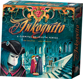
A carnival of spies in Venice.
This classic Clue-like game of deduction has been around for a while (since 1998), but I was lucky enough to be asked to re-design the visuals for its 2013 re-release by Ares Games. At the time I suggested changing the character names as well, but in the end they decided to stick with the old ones, including such suspiciously named characters as ‘Lord Fiddlebottom’. In hindsight, they were right to keep the silliness!
The game itself is a relatively light affair, as you move around Venice asking questions of other players to find out who your partner-in-spying is, discover your mission, and win the game. But it’s also often hilariously fun, since each character has a distinctive trait (tugging the earlobe, looking down the nose, etc) which you can exploit to fool your opponents. And who can deny the attraction of that huge, overproduced ‘Phantom of Prophecy’ ball shaker, truly one of the most over-the-top game components you can still find in a modern game. Inkognito just wouldn’t be the same without it.
Designer Diary
Ares Games, makers of such wonderful boardgame classics as War of the Ring (one of my favourite games of all time) and Wings of Glory, posted The (re)making of Inkognito—what’s new in the new edition of this classic on their website, an article about the re-release of this game of mystery and deduction set in between-the-wars Venice. Universal Head worked on the graphic design for the complete refresh of this excellent boardgame by Alex Randolph and Leo Colovini.
“We decided that the game needed a restyling of the graphic design, but we wanted to keep the original art by Studio Tapiro, that granted a “Most Beautiful Game” reward to the game by the Spiel des Jahres jury. So, we asked Universal Head, the New Zealand graphic design studio headed by Peter Gifford, to bring the design to state-of-the-art standards. We were very pleased by the treatment that Universal Head gave to our Aztlán game, and we were sure that Peter could do very well with Inkognito.”
There were some very interesting design challenges with this project. For example, I had to revamp the look and feel of the game, and create new designs, while retaining the quirky watercolour illustrations of the original. So the backs of the ‘passport’ screens took quite some work, as I used parts of the illustrations and added new components that I had to modify in Photoshop to match the original, traditionally-painted style.
Another was conveying the somewhat nebulous time period of the game—the art focuses on the old carnivale event in the city with its Renaissance trappings, while the game is actually about pre-World War spies and speedboats! The solution was to use both ornate decoration from the Renaissance and period-accurate early modern fonts. It took considerable effort to make these disparate styles work well together, but the result has quite a unique feel that I think, for the first time, comfortably positions the game in its own unique setting.

